Booking Platform · Full-Stack Frontend
Beauty by Amy
Outcome
Self-serve booking, not DMs
Beauty by Amy is an independent nail tech whose site was a four-page college project, nice to look at, with no way to book, so appointments piled up in DMs and texts. I rebuilt it as a React booking platform: a 5-step wizard a client can finish on her phone in under two minutes, and a password-gated admin where Amy runs her schedule. Dark mode and a full motion system sit on the same brand, now engineered for an actual business.
- Year: 2024
- Duration: 8 weeks
- Team: Solo · Design + Engineering
- Role: Designer & Frontend Engineer · Solo


Read the full breakdown
The problem
The original site looked like what it was, a course assignment. Static pages, no booking, no way for Amy to manage her schedule, no mobile parity. Inquiries lived in DMs and texts. There was no system, just a pretty wrapper around manual coordination.
The goal
Ship a real product. Public site that earns trust on first impression, a booking flow Amy's clients can complete on a phone in under two minutes, and an admin layer Amy can actually run her appointments from, all in one codebase, fully responsive, fully accessible.
Hypothesis
A mobile-first booking wizard with progressive disclosure, an admin dashboard built from the same component library, and a token-driven design system will turn a static portfolio site into something Amy can use as her actual business backend, without needing a dedicated booking SaaS.
Research
Participants: Amy (the client) + informal usability checks on the booking flow with 5 friends/family in the target demographic
Methods
- ▸ UX audit of the v1 college site
- ▸ Competitor review of Fresha, GlossGenius, Square Appointments
- ▸ Service-business booking pattern research
- ▸ Mobile-first usability principles
- ▸ Framer Motion animation pattern study
Key findings
- 01
The v1 was a 4-page static site, no booking system at all, no admin, nothing persistent
- 02
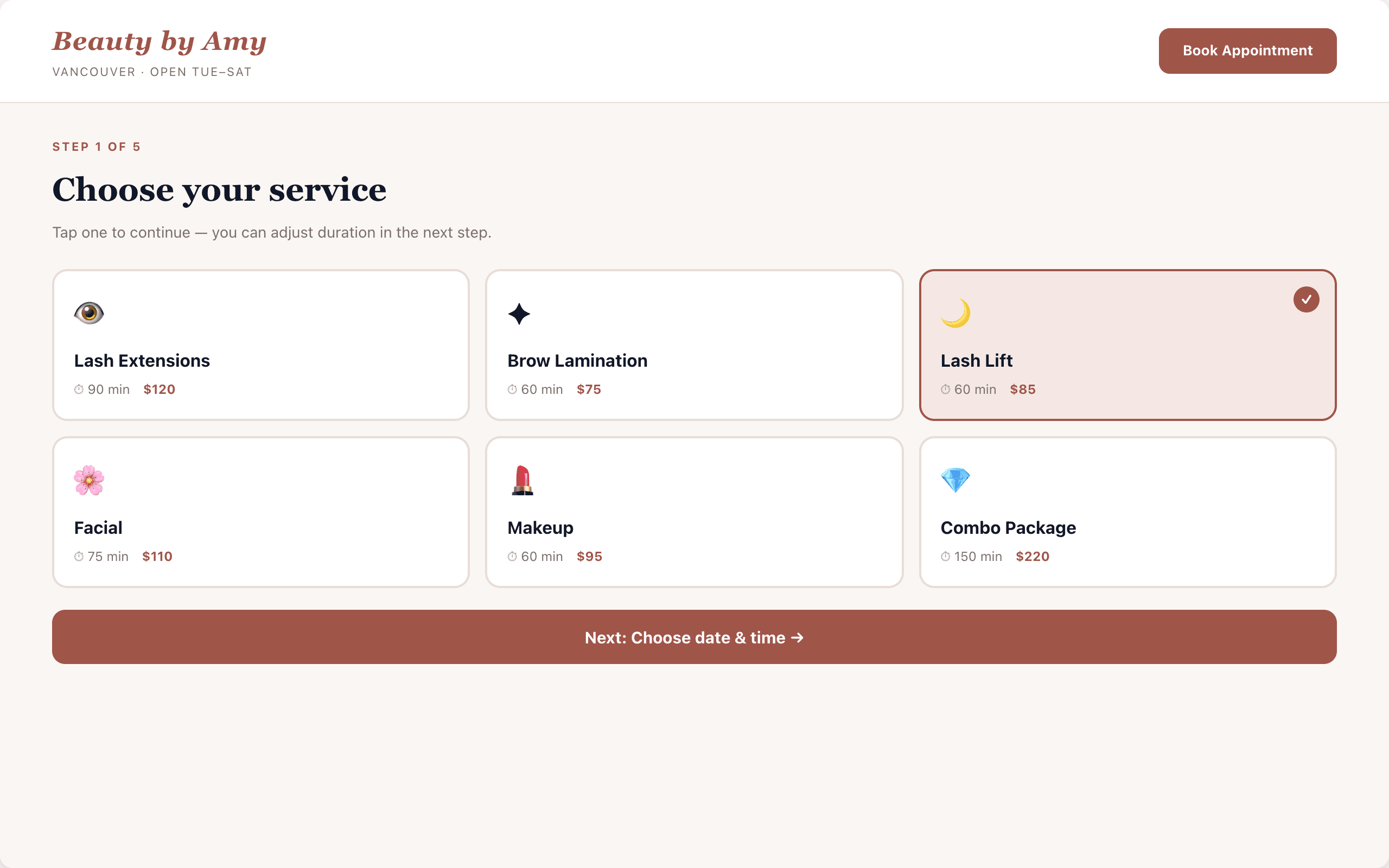
Established booking products favour short multi-step wizards over single-page mega-forms, so I built the flow as a focused 5-step wizard
- 03
Service businesses need an admin dashboard, not just a public site, bookings have to land somewhere
- 04
Motion design carries premium perception: page transitions, spring physics, staggered reveals
- 05
Dark mode is now a baseline expectation for portfolio-grade work
What the research told me
Two products, one codebase
A booking platform is really two apps, a public-facing site and an admin app. Building them from the same component library and design tokens kept the brand consistent and the build small.
Persistence without a backend
localStorage handles bookings, clients, and availability. Lets the demo work without infrastructure, while the architecture stays ready to swap in a real API.
Motion is part of the brand
Framer Motion isn't decoration, staggered reveals, spring buttons, page transitions are what makes the experience feel premium instead of generic.
Tokens travel further than CSS
Encoding brand color and spacing into Tailwind tokens meant dark mode, hover states, focus rings, and the entire admin layer all stayed on-brand without me re-deciding anything.
Design
Iteration
Vanilla HTML/CSS, 4 static pages
User insight
"The college version had no booking, no persistence, no admin. Beautiful as a layout exercise, useless as a product. Every interaction was a phone call."
Design change
Decision: throw out the implementation, keep the brand. Restart in React with a real architecture: routing, context, persistence, and an admin layer from day one.
React rebuild, wizard, no motion
User insight
"Got the 5-step wizard working with bare components. Functionally complete but felt mechanical, every page change was a hard cut. The brand promise was "premium", the experience felt like a form."
Design change
Layered Framer Motion across the app: page transitions with custom easing, staggered scroll reveals, spring physics on buttons, animated success state. Same logic, completely different feel.
Admin dashboard + dark mode
User insight
"Public site shipping was only half the product. Without an admin layer, Amy still had to track bookings in a notebook. And dark mode had become a baseline expectation for portfolio work."
Design change
Built the password-gated admin app at /admin: Overview stats, Appointments CRUD, auto-built Clients view, Availability calendar. Wired Tailwind dark mode via class strategy with system-preference detection. Shipped.
Design system
Colour palette
- brand-600 / primary CTA
- brand-500
- brand-400 / hover
- warm-50 / page bg
- warm-100 / alt sections
- warm-900 / primary text
Typography
Playfair Display (display headings) + DM Sans (UI + body), editorial serif for brand moments, neutral sans for everything functional
Key components
- ▸ Atoms: Button (spring), Input, Badge, Card, NavLink
- ▸ Booking: ServiceCard, DatePicker, TimeSlotGrid, ProgressStepper, SuccessState
- ▸ Admin: StatTile, AppointmentRow, ClientCard, BlockedDateCalendar, AuthGate
- ▸ Motion: page transitions (400ms cubic-bezier 0.22,1,0.36,1), staggered reveals via useInView, spring buttons, animated check-draw
- ▸ Theming: light + dark mode via Tailwind class strategy with system-preference detection
Outcome
Shipped a deployed, production-grade React booking platform: 4 public pages, a 5-step booking wizard, a 4-tab admin dashboard with full CRUD, complete dark mode, and a documented animation system. Built on React 18 + Vite + Tailwind + Framer Motion. The original 4-page college project rebuilt as something Amy could plausibly run a business on.
What I learned
- 01
A real product is the public site plus the admin layer. Building them in the same codebase from the same tokens is what keeps a solo build maintainable.
- 02
Motion is brand. Framer Motion across page transitions, scroll reveals, and button springs is what separates a "site" from a "premium experience."
- 03
localStorage is a legitimate persistence layer for portfolio and demo work. The architecture decision is to keep the data layer abstracted so swapping to a real API later is a one-file change.
Next case study
Mini Pancake Co.
E-Commerce + Booking · React Rebuild