Design System · Component Library
BEYOND Skincare

Outcome
Two themes from one token layer
Brand sites start clean and decay fast: colors drift, dark mode gets bolted on later, components get forked for one-off pages. So I built BEYOND as a system instead of a site, a token layer first, then 20+ atomic components that read from it, with light and dark themes and WCAG 2.1 AA built into the tokens. A live docs site renders every component next to the code to use it, and a sample brand site proves the whole thing holds together.
- Year: 2024
- Duration: 12 weeks
- Team: Solo · Design + Engineering
- Role: Design System Lead · Designer & Developer

Read the full breakdown
The problem
Brand sites often start clean and decay fast. Colours drift, spacing stops being consistent, accessibility gets patched in later, and components get forked for one-off pages. The first BEYOND explorations suffered from the same thing, no token layer, no component reuse rules, and no way for a future teammate to ship on-brand UI without reinventing it.
The goal
Build a design system that enforces the brand visually and technically: one source of truth for tokens, one component library for UI, built-in dark/light theming, and a documentation site that doubles as a live sandbox.
Hypothesis
If the brand language is encoded as design tokens and composable components, atoms, molecules, organisms, a single designer-developer can ship a full website, a documentation site, and a theming layer in one codebase without the UI fragmenting over time.
Research
Participants: Instructor + classmate reviewers + self-directed research
Methods
- ▸ Brand audit of skincare market leaders
- ▸ Design system benchmarking (Material, Shopify Polaris, Atlassian)
- ▸ Atomic design methodology review
- ▸ WCAG 2.1 AA contrast and keyboard navigation audits
- ▸ Developer ergonomics review of Tailwind-based systems
Key findings
- 01
Successful systems separate brand tokens from component logic, the two should be independently versionable
- 02
Dark mode breaks when colour is hardcoded; it works when every colour goes through a semantic token
- 03
As a general rule of thumb in design systems, atomic structure scales better than a flat component list once a library passes ~15 components, which is why I split BEYOND into atoms, molecules, and organisms
- 04
Interactive docs beat static docs, developers copy working code, not screenshots
- 05
WCAG 2.1 AA has to be designed in from the start: retrofitting contrast and focus states afterward is broadly understood to cost far more than building them in, so I baked accessibility into the tokens from day one
What the research told me
Tokens before components
The system has to start with a tokens layer, colours, typography, spacing, shadows, radii. Components consume tokens. That split is what lets dark mode, rebrands, and theming work without touching component code.
Atomic design actually holds up
Splitting into atoms / molecules / organisms made the library easier to reason about as it grew to 20+ components. Each layer has a clear job.
Docs are product
Documentation pages are first-class screens in the app, not an afterthought. Each component page shows the component, its variants, and the code to use it.
Accessibility is a system property
Baked WCAG 2.1 AA contrast into tokens, keyboard focus into components, and skip-links into layout. Accessibility lives in the system, not in individual pages.
Design
Iteration
Hardcoded colours, no token layer
User insight
"First pass used Tailwind defaults directly. The second I tried to add dark mode, colour references were scattered across 12 files. There was no single source of truth."
Design change
Extracted every colour, font, spacing, shadow, and radius value into a tokens directory. Configured Tailwind to extend from tokens. Components now only reference semantic names like bg-surface, text-primary, border-subtle.
Flat component list
User insight
"With ~20 components in one folder, it got hard to tell which pieces could be composed from which. Button and IconButton lived next to Navbar and ProductCard."
Design change
Restructured into atoms / molecules / organisms following atomic design. Each layer only imports from layers beneath it. Made dependencies explicit and the library easier to scan.
Static docs pages
User insight
"Documentation was screenshots plus code blocks. Developers had to mentally simulate the component instead of seeing it live."
Design change
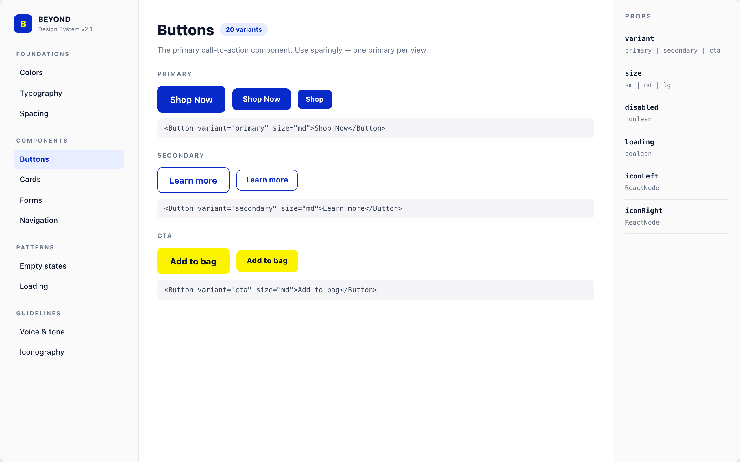
Rebuilt docs as actual React pages that render live components alongside their source. Each category (Colors, Typography, Spacing, Components, Forms, Navigation) became its own interactive page. Shipped.
Design system
Colour palette
- Primary / royal blue
- Secondary / azure
- Accent / sky
- CTA / citron
- Neutral ink
- Neutral surface
Typography
Open Sans (UI + body) + JetBrains Mono (code), 15-step type scale from label-sm (11px) through display-lg (clamp 40→64px)
Key components
- ▸ Atoms: Button, IconButton, Input, Badge, Avatar, Tag
- ▸ Molecules: FormField, SearchBar, ProductCard, Toast, Tabs
- ▸ Organisms: Navbar, Footer, Hero, ProductGrid, Form layouts
- ▸ Theming: dark / light mode via semantic tokens
- ▸ Accessibility: WCAG 2.1 AA across all components
Outcome
Shipped a live, deployed design system with 20+ documented components, six interactive docs categories, full dark/light theming, and a sample BEYOND brand site built entirely from system primitives. The system is version-controlled, deployed automatically via GitHub Actions, and publicly browsable. It demonstrates the full loop from design tokens through to a production-ready branded experience.
What I learned
- 01
A design system only holds together if tokens come first. Everything else, theming, accessibility, rebrands, becomes easier the moment you stop hardcoding values in components.
- 02
Atomic design is not academic. Once a library passes ~15 components, splitting into atoms, molecules, and organisms starts paying back in clarity.
- 03
Documentation is part of the product. Interactive docs that show live components plus their code lower the friction for anyone building on top of the system.
Next case study
Beauty by Amy
Booking Platform · Full-Stack Frontend